Since the launch of Unity Insights, a core element of many of our evaluations and analyses has been the use of population health informatics, observing whether local strategies and interventions have helped reduce health inequalities, or using analytics to identify at-risk communities. The development of dashboards to collate and provide access to these data has proven a key part of this work, providing a platform for commissioners to explore data, drawing direct comparisons to inform decision making.
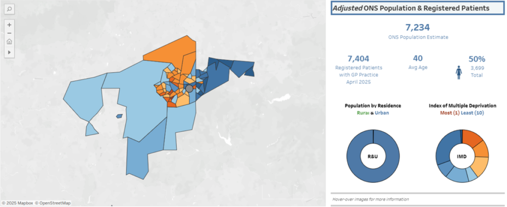
The combination of population metrics with service data provides a valuable cross-section of potential impact, supporting the observation of engagement across a variety of demographic factors, informing future spread and delivery processes. The below example provides an overview of the population within a sub-ICB area, breaking down the age, gender and ethnicity of an area, while introducing further metrics related to local levels of deprivation and digital maturity.
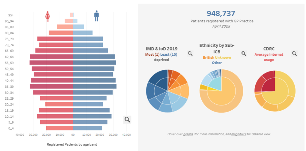
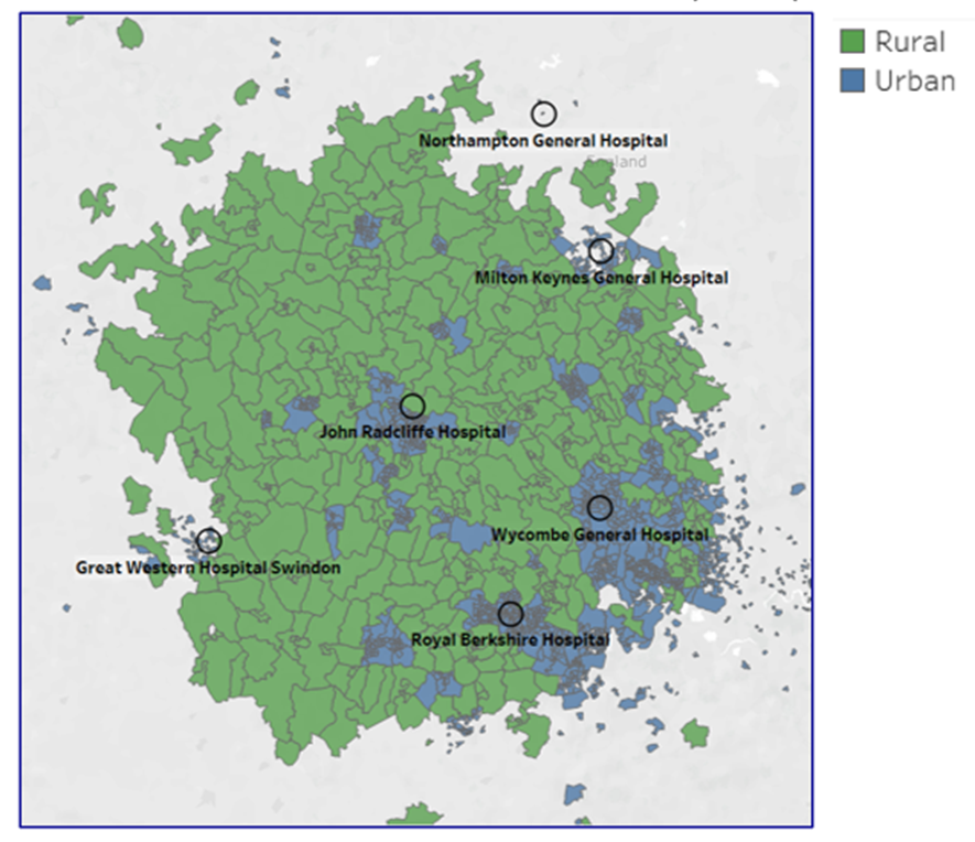
The presentation of clinical system data, along with population health insights, provides a framework to observe potential social determinants of health in a real-world context, allowing consideration of local demographic and logistical challenges (such as delivery across rural and urban areas).
Using this population data, Unity Insights have often provided a bespoke dashboards to support NHS and local authority-led programmes, ranging from clinical specialties, such as stroke, patient deterioration, and pharmaceutical interventions, to broader digital improvement programmes. The latter of these has been a significant theme over the last few years, developing from supporting the pre-pandemic “Digital First” programme, which supported the rapid delivery of online and video consultation services throughout primary care in 2020, and later led to a broader assessment of regional digital maturity, covering the population needs, primary and community care delivery and acute system infrastructure.
As outcome data is provided, the depth of insights increases, allowing for observation across a wide range of settings, and supporting statistical inference that can be used to identify trends in delivery and engagement.
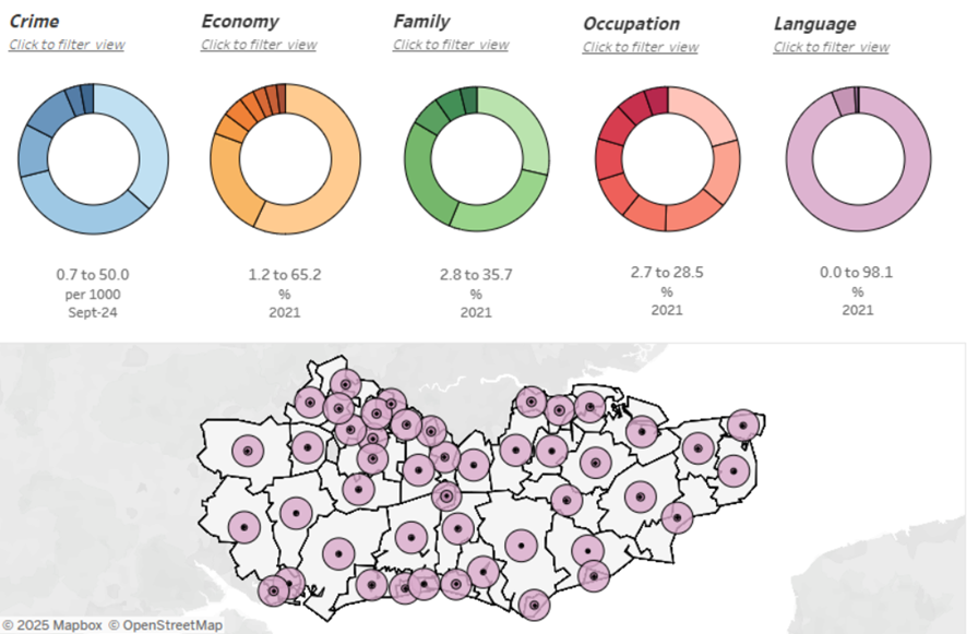
By providing a flexible insight into programme delivery and outcomes across the community, these population health dashboards have supported ongoing quality improvement campaigns and commissioner decision making. Specifically, these relate to risk stratification and the development of mitigation strategies, a clear evidence-based framework for service planning that can be utilised to inform future programmes as well as the continuation of existing ones, furthermore these views put the needs of the community at the heart of decision making, ensuring that services and interventions can be efficiently and effectively deployed.
Our insights:
Population health dashboard development
Dashboarding for populaiton health improvement
Learning about data analytics and impact assessment as part of Digital Fellowship programmes
Learning about data analytics and impact assessment as part of Digital Fellowship programmes
Health Innovation Oxford & Thames Valley Health Inequalities dashboard suite
Supporting the implementation of the Polypharmacy programme with a health inequalities dashboard
Impact reporting – Kent, Surrey, Sussex
Ongoing impact analysis for Health Innovation KSS.
Intelligent Intermittent Auscultation Dashboard
Development of an interactive dashboard to measure the impact of IIA e-learning
Health Education England AI Roadmap
Developing a roadmap of AI-driven technologies and interactive dashboard to explore the use and impact of AI in the NHS
Acute Heart Failure
Using analytics to drive rapid implementation of best practice for heart failure services
Asthma Discharge Bundle – Adopt and Spread
Utilising NACAP’s public audit data to develop a baseline for asthma discharge bundle delivery.